
....And I'm back at home. About a half hour after…
More Wedding Invitation Ideas
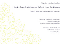
I’ve been playing around with that oak bracket pattern some more and came up with three different invite design ideas (yes, those are fake names).
I still feel like they are too plain. Probably because I can’t visualize the letterpress texture. I’ll try a vertical layout or some more variations of the oak pattern. What do you think?
Design A: Outline on White
Design B: White on Yellow
Design C: Yellow on White
At least I have a lot of time to experiment!

Next Post: Sale Alert: L’Occitane
Previous Post: What to Wear: Pearls!
LOVE the white on yellow!!
white on yellow, hands down.
I don’t know what exactly what you’re looking for but these reminded me of your samples.
http://www.rosebudweddings.com/readymade.html
Check out the Emma and Samantha designs. Hope it helps!
PS – I think they look great already!
I agree. The white on yellow rules.
I’m torn between the white on yellow and the yellow on white. If you are feeling like they are too plain maybe play with the thickness/thinness of the oak? Or, make one part of the leaf have a bit more detail than the others. Or just use a different font for your names. They are all beautiful.
White on yellow steals the show!
2nd one, then 3rd then 1st. LOVE them!
I love the outline on white! These look great!
white on yellow!!
I like the first one best.
white on yellow is very gorgeous and i think would be a wonderful tease to your whole wedding festivities!
white on yellow!
Am I the only one who likes the last one best?
No question, white on yellow. It’s gorgeous! I want to be invited just for the pretty invitation. Actually, it all sounds really amazing!
Maybe you could emboss the oak leaves or do something that contrasts like matte background and glossy for the design. I like the yellow background with the white design.
B, B, B, B, B!
Second one. Beautiful.
Yep, white on yellow.
Design B for sure!
I like the yellow paper.. option C. Could have more details though. looks good!
WHITE ON YELLOW for sure!!!
White on Yellow is so pretty.
White on Yellow is my first choice.
However, I like the last one but with the script also in yellow. I’ve seen this before in MSL and it looks so good. I don’t know but maybe it would be cheaper being a two-color job too?
Option C is wonderful. Text on white is so much easier to read but the bold yellow of the design carries the motif. The third is my vote (from a recent bride who dealt with bitching that text on color was too hard to read.)
Gorgeous nonetheless.
love the white on yellow, but keep in mind that it can be harder to print white on colored paper than colored printing on white paper.
and letterpress’ 3-d quality makes everything look fancier, but if you think they’re too plain just try adding some more pattern – maybe you want to go full border with text in the middle?
a little late to the discussion but I love #2
I like Design C, Yellow on White!