I love finding an incredible new store in San Francisco.…

Wedding Invitation Drafts
 I know it’s really early, but I’m a graphic designer and I’ve started playing around with some ideas for the wedding invitations.
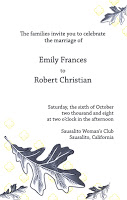
Here’s a rough sketch I’ve created using oak leaves and a repeating clover pattern. The oak is for the giant oak tree outside the club and the clover from the Julia Morgan designed light fixtures.
It’s a work in progress for sure. I need to try it with different fonts, different colors, darker clovers, Japanese maple leaves instead of oak or maybe a flower instead of a leaf. Any great examples of letterpress design you want to share?
Next Post: What to Wear: One Dress Two Ways
Previous Post: Feeling Overwhelmed


Your invitations were gorgeous! Please re-post the link 🙂
Sorry, I messed up my links in that comment, let’s try again!
I wasn’t able to swing letterpress, but a graphic designer friend (who now makes amazing letterpress and regular cards) turned a photo of a leaf carving at the church where we got married into a motif for all the stationery. I posted pics here.
It was really nice to tie in an element of the wedding location! I used the same leaf on placecards, etc. and those blank cards are my thank you notes–I didn’t have “Thank you” printed on them, so I can use all the extras for regular notecards.
I love those invitations. I have to admit that I was hugely inspired by Paper Source’s wedding line. Check it out!
i like them too. i think the wording “the families” is sort of awkward but besides that i like them.
That wording is just place holder text 🙂
check out the D*S letterpress guide – lots of great letterpress companies and good inspiration over there.
http://dsletterpressguide.blogspot.com/
do NOT change the oak leaf! it’s much more unusual than the maple leaves or flowers. but i could see darker or redder colors being really nice.
I really like those invites.