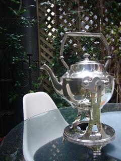
This silver piece is one of my favorites. A coffee…

Inspired: Pantone 141
 Say hello to our new friend, Pantone 141. This is the color of the main wall in the Yosemite Solarium, the color of dogwood trees in October and a close companion of mine for the next 516 days. (Yes, I took my Pantone swatch book to Yosemite. Huge. Nerd.)
There are so many colors at the Ahwahnee hotel; lots of natural reds (180), sage (5625), blues, greens, browns and oranges. But I kind of feel like tapping into this yellow wall color with the flowers and decorations will make the biggest impression in the reception hall.
But now that I’ve chosen it, I am admittedly pretty stumped. Yellow isn’t one of my favorite colors to design with and I’m not sure where to go. Any ideas?

Next Post: Weekend Round-Up: Colors
Previous Post: Things I Love Today: White Jeans
did you book a date there yet?
Not yet, but I’m going to call tomorrow. Probably October 12 if we can get it 🙂
That reception hall is a dream! How lovely! I think yellow is a wonderfully carefree color. Perfect for a wedding. I wish I knew you in real life so I could be there. But in real life, I just compulsively check your blog.
What’s wrong with stealing the yellow/gray idea from Martha Stewart? I thought it was fabulous.
I learned in helping out in my cousin’s wedding that green is the ideal bridesmaid dress color to accentuate the flowers they will hold. Just thought I’d give you the tip! She ended up using dark forest green dresses with a mint green piping or sash, depending on which cut you preferred. Her wedding was outdoors in an equally rustic place, only across the country in Block Island, off of Rhode Island. If you want some pictures from the event I’m happy to send them to you! Best of luck with it all!
do you like daisies? you could do a really pretty daisy theme. I think MS has one on her website.
If that is the wall color and your having the wedding in the fall and you are using the blue and teals in the Vogue picture, then I think it might be beautiful to use Sunflowers. There are some very elegant varieties in reds and rusts that would complement that color nowadays with long and even ruffled petals that are compact and incredibly beautiful that would also add to the autum feel maybe with delicate sprays of Angel Hair fern and maybe one tiny bit of red foliage and even a little sprig of pine if there is something delicate enough. It is a trick because Yosemite is grand and rustic in one way but very elegant in another. I also love those tiny yellow mums that are just that color, but it depends on the dresses. I don’t see mums with satin somehow.
Sorry love.boxes, but Emily should nix your chrysanthemum idea — too funereal. I vote to keep your sun flower and fall foliage suggestion, though, but keep it simple and add in some curly willow or other interesting twig indigenous to the area. I think she should use smooth rocks with names written on them as place cards to help bring the outdoors in.
these pots could look pretty nice as centerpieces.
http://www.crateandbarrel.com/family.aspx?c=2014&f=23950
sorry to post so much! but i was just thinking. 🙂
what about incorporating ferns?
you could get some candeles like these: http://www.crateandbarrel.com/family.aspx?c=4610&f=7441
and press little ferns into them.
this candle is nice too and would work in a lot of the room’s rich colors. 🙂
http://www.crateandbarrel.com/family.aspx?c=4610&f=13277
I love the all the ideas! Keep ’em coming 🙂
Sometimes you can still get garden roses in October. “Graham Thomas” would be awesome.
like this arrangement?
http://www.flickr.com/photos/lenacorwin/271680320/
she has lots of other wedding photos up too..hers was featured in ms weddings.
Maybe you could incorporate dogwood branches in tall glass vases? Something like this, but with yellow dogwood:
http://weddings.theknot.com/gallery/gallery_details_pop.aspx?gallery=27&itemnumber=11 (Might need to be taller/thinner, though, for people to see over it!)
If your wedding is in the evening, candles hanging from the branches of a larger, sturdier arrangement would add a lovely touch, too…
Gorgeous place to have a wedding, btw!
Ok, I have to say it— deep purple looks completelly stunning next to your new pantone friend. Plus it is rich/deep enough to offset the white dress of your own. I think it would be gorgeous with all fall golds and Ahwahnee yellows.
Think Amethist in Gold!
That is exactly the same color of my new spring/summer bag. I’ll be living with it for a while so no worries. To me it seems to be a very “in” color, see J.Crew. So far great with blue and brown.
You have plenty of time to think about flowers.
Marga