Want your next cocktail party to rock? Of course you…
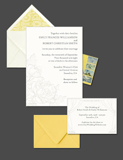
Wedding Wednesday: Proof of Concept
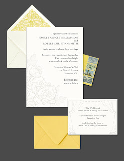 My vision for the wedding invitations is pretty well sketched out now. I sent this “proof of concept” mock-up to Jordan and she gave it the go-ahead.
It’s really rough, so now I’ll need to go back and work out the details for the final version. The text has to be written, fonts need adjusting, the images need to be purchased, the flower design updated and the envelope liner found. Jordan shared a great resource for printed paper for the liners.
Next Post: To Do: Campaign
Previous Post: Wedding Wednesday: Registry Options

I think it looks great. What fonts are you going to use? Are you looking to use a yellow paisley pattern or is that just a general idea?
P.S. I’m sure you’d catch it before anything happened, but eight is misspelled
Arg! I thought I fixed that last time…I’d rather have a simpler yellow and white pattern. Paisley is all I could find right now. Up in the air on fonts…right now it is High Tower Text
I love those little curtains on the save the date. It’s all really lovely.
I love them! Especially the little curtains on the Save the Date card (hinting at your variety show?). Love it.
Please don’t ever forget that I am sitting by, vicariously re-living my wedding through you!
Very nice! We used a right-justify template, too. It’s so satisfying when you get your invites in order – it’s such a big part of the wedding aesthetic.
Beautiful!!
PS – “eight” looks right to me…